
Let's Talk Wardrobe...
- dontblinkportraits
- Aug 18, 2020
- 5 min read
Your sweet little family (or extended family) is due to update your portraits and you, of course, want them to be Pinterest perfect, but you've got a thousand things to do besides consider "what shall we wear?" Plus, I know what you're thinking, (insert eye roll) "Not another blog about how to pick out clothes for a photo session! Those are all over the Internet already!" YES, I hear you, and AMEN! If anyone is not a fan of reading the same content over and over again looking for fresh information it's this girl!
I actually get asked this question a lot, so I wanted to share my top 4 tips regarding wardrobe choice from the photographer's point of view. Here we go:
1. Kermit was right. It's not easy being green... If your portraits are being taken outdoors, be mindful of the season, and by that I do not just mean the temperature, but also the colors you'll have as your backdrop. For example, I have taken many family portraits at my good friend's farm. There's a gorgeous field of tall grass and trees as far as you can see. In the spring, summer, and early fall at this location, I advise my clients to avoid wearing greens. Nothing is more bland than a portrait of someone clothed in green sitting in a green field of tall grass with lots of green trees. Additionally, if your session is mid-day or in the early afternoon, the sunlight will be coming straight from above and reflecting off of, you guessed it, the green grass, making everyone have a green tint to their skin. Some of this can be corrected in editing, but please (I'm begging you) don't rely on that. Sometime color casts on skin tones can be very tough to correct (and time consuming)!
If green is absolutely your color and you have to wear it, go with a darker tone or green as an accent color instead of a solid shirt or pants. The same rule is true for wearing light tans in golden fields of grass during late fall/winter or dark red shirts against big red barns. You get the picture (pun always intended). Below is an example where there is a little too much green. I converted the image to black and white and what a difference!


The same concept is true for in-studio portraits on a black, dark gray, or solid white backdrop. Try to avoid everyone in your group wearing solid black shirts/dresses. When grouped together on a dark background, everyone begins to look like a big black blob with multiple heads and limbs poking out. As a photographer, I want you to stand out from the background and see each distinct member of your family. How do you avoid this? One way is to choose coordinating colors or mix up your neutrals. For example, you can have a mix of blacks, grays, tans, and whites and just alternate those colors on shirts and bottoms. (Ex: one person wears a black shirt with tan pants, another wears a white shirt with black pants, etc.)
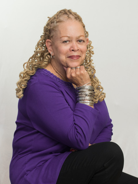
The newborn portrait below is from the very beginning of my career, and I have learned so much since then. See how the parents' bodies kind of morph into each other and the backdrop? Now I advise my clients for much better outcomes, like this head shot. The purple pops and compliments her skin tone so well!


2. Polka dots, stripes, and plaids, OH MY! When planning a group portrait, I usually advise my clients to be cautious when wearing patterns, especially on multiple people who will be in the same shot to avoid clashing. Also, some stripes and smaller patterns look distorted when photographed, especially on synthetic fabrics (you know, the fabulous ones that don't wrinkle) because the fibers sometimes reflect light. There's absolutely nothing I can do post-production to fix this issue and it is a huge distraction in your portraits! How do you avoid this problem? One solution is to choose patterns on cottons or other natural fibers. Or, you can have one person in a pattern and the rest of the group wearing colors from that piece of clothing. This is what I did with our beach pictures this year, and I loved it! Carrigan's flowing, patterned dress looked so flattering on her I had to get a picture of her in it, so I dressed the twins in the matching light and dark denim rompers!

3. Girl...get your nails did (or un-did)! I am not a "girlie girl" whatsoever, and I have had a professional manicure/pedicure perhaps four times in my life, so I am NOT advocating that my clients pay their hard-earned money to go get their nails done before every photo shoot. However, one of my biggest editing nightmares is chipped nail polish!!! I can touch up zits, stitches, scars, and spots on your shirt, but it takes so long to try and patch up nail polish or remove tiny speckles of it off your nails in post-production. And if I can, it is hard to make it look natural. So, either get your nails painted or go all-natural and remove any straggling nail polish before your close ups! Either way photographs well, just not in-between.
Here's an example where I spent wayyyyy too much time touching up nail polish! Again, it is my fault for not advising the client better beforehand!


The guys reading this might think they're out of the woods on this one, but the male portrait faux pa equivalent to chipped nail polish is getting a fresh hair cut right before your photo session, especially in the summer! Why? Most guys, like my husband, get a pretty dark tan on their faces and necks in the summer and sometimes a fresh hair cut around the neck and ears will leave a glaring white stripe where your hair used to cover. Another weird tan line I see on guys (and sometimes girls) is from wearing sunglasses and they get that white stripe on their temples. Makes me giggle every time. How do we fix this? Get a hair cut about a week before your session and be mindful of your sun exposure a few days to a week beforehand, too.
4. Graphics, characters, and shoes: Everyone longs for that perfect, timeless portrait to proudly display above the mantle (or maybe it's just us moms). One thing I have noticed in taking portraits is that shirts with logos, too much writing, or cartoon characters can (1) be distracting (because the letters get wrinkled and distorted as you sit or twist and you can't read what it says) and (2) date the portrait (raise your hand if you have a childhood picture wearing a Tweetie Bird shirt...no one? Just me?) For timeless portraits where your smiling face is the main focus, stick to solids or acceptable patterns as discussed above.
Below is an example where Sponge Bob was stealing the spotlight. To put the focus entirely on this little guy and his best friend, I edited out the graphic. Time-consuming editing like this can be a fun challenge for me, but it takes me longer to get your portraits back to you to enjoy!


Another aspect of your portrait wardrobe you may not think about (until it's too late) is footwear. With small children I almost always advocate for no shoes or socks at all because I mean, baby toes are the absolute cutest! This is also because most children's footwear has some type of logo, colored writing, or even dirt or gum down in the tread of the shoe, and most often in portraits children are seated with their feet facing the camera and the soles of the shoes are visible in the picture. For bigger kids, adults, or situations where the weather calls for it, weather-appropriate, neutral-colored footwear works just fine!
As promised, there's my top four wardrobe considerations from real-life experience as a portrait photographer. Hopefully, these tips were something you haven't read before and they will help make picking out your next portrait wardrobe much easier (on you and me).
Much love,
Becky


Comments